ACTIONS
TT Revlis required our expertise in coding and design work in order to create an elevated site with a strong user interface that would allow customers to navigate seamlessly around the site.
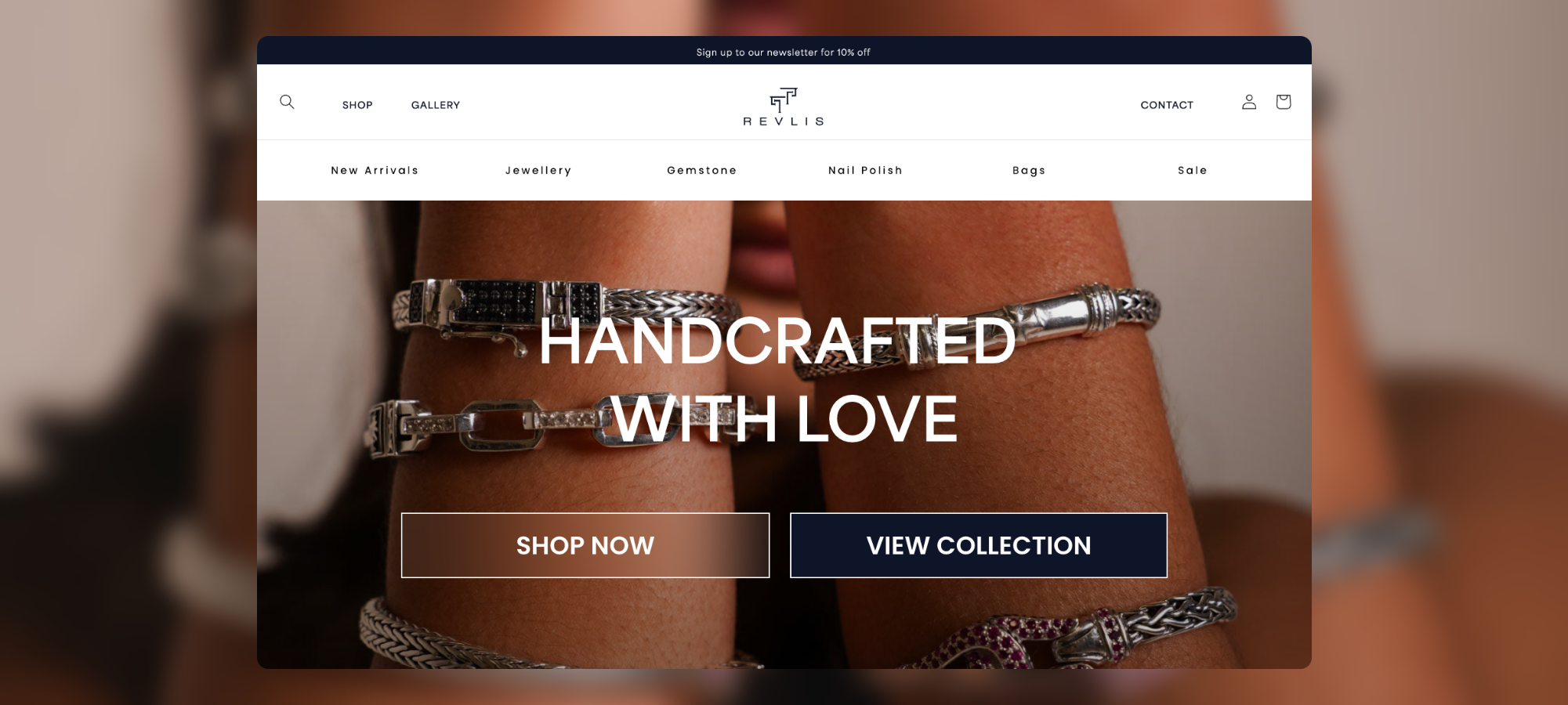
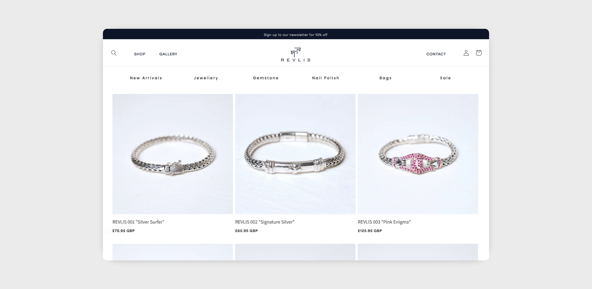
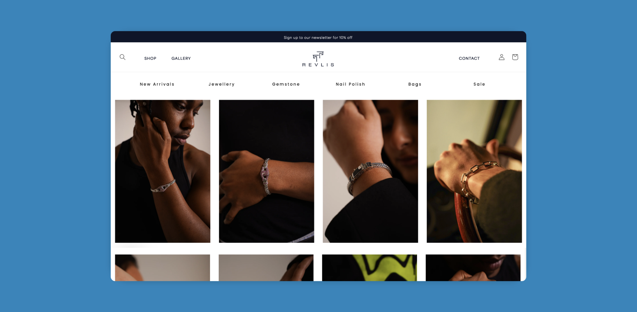
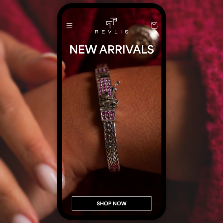
With their product being primarily visual, it was crucial for the website design to support their product photography. Keeping this in mind, we designed a stunning product lookbook which customers can browse before purchasing. We designed a product spotlight on the homepage, highlighting bestsellers, which means that customers can now navigate to checkout in just a few clicks.
Another important element of our design was the site’s new connection with Klaviyo, allowing for email marketing automations directly on the website. With clear guidelines from Anish and Rishab, we seamlessly integrated their clear branding elements and segments of colour from their original design into our new, stylish, and sophisticated one.
RESULT
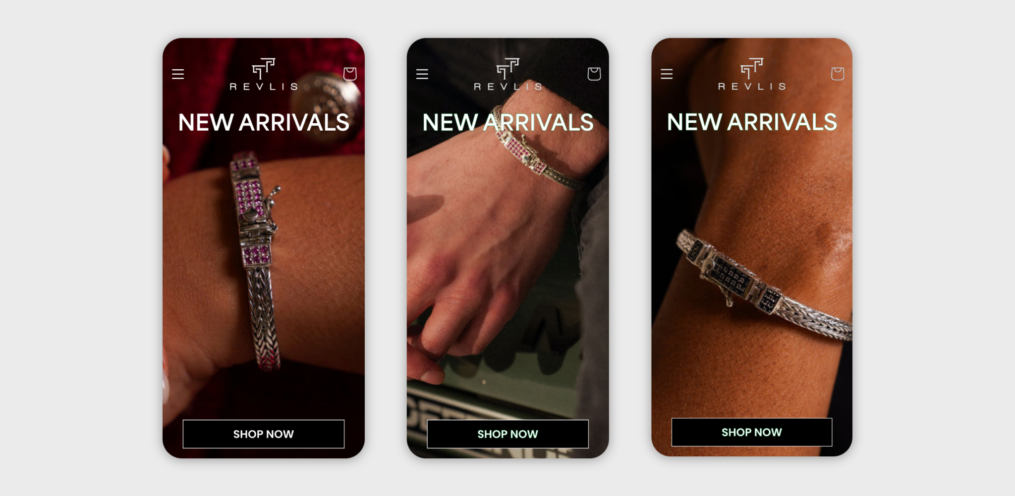
The introduction of strong brand elements and the design of a seamless user journey flow means that customers can now quickly and easily navigate from product pages to checkout. Our new design has meant that user engagement has improved and users are spending longer on the site. We have provided TT Revlis with a refreshed ecommerce site which now appropriately matches the elegance and grace of their products.
From the product photography and branding to the messaging and copywriting, we created a site which was sleek, masculine, and elegant, perfectly reflecting their young audience who appreciate long lasting quality jewellery.

