SWEETSTAY

Creation of a simple yet effective logo & branding to represent this modern and respectable hospitality company.


SWEETSTAY Main image

THE BRAND

SWEETSTAY are a hospitality company based in London that specialises in sourcing short and medium-term accommodation for professionals and holidaymakers in different locations in Europe. They seek out the best homes, looking for space, character and comfort. Taking the best hospitality elements and years of experience in property management, their goal is to offer hotel-quality home rentals.


brand-logo
APPROACH

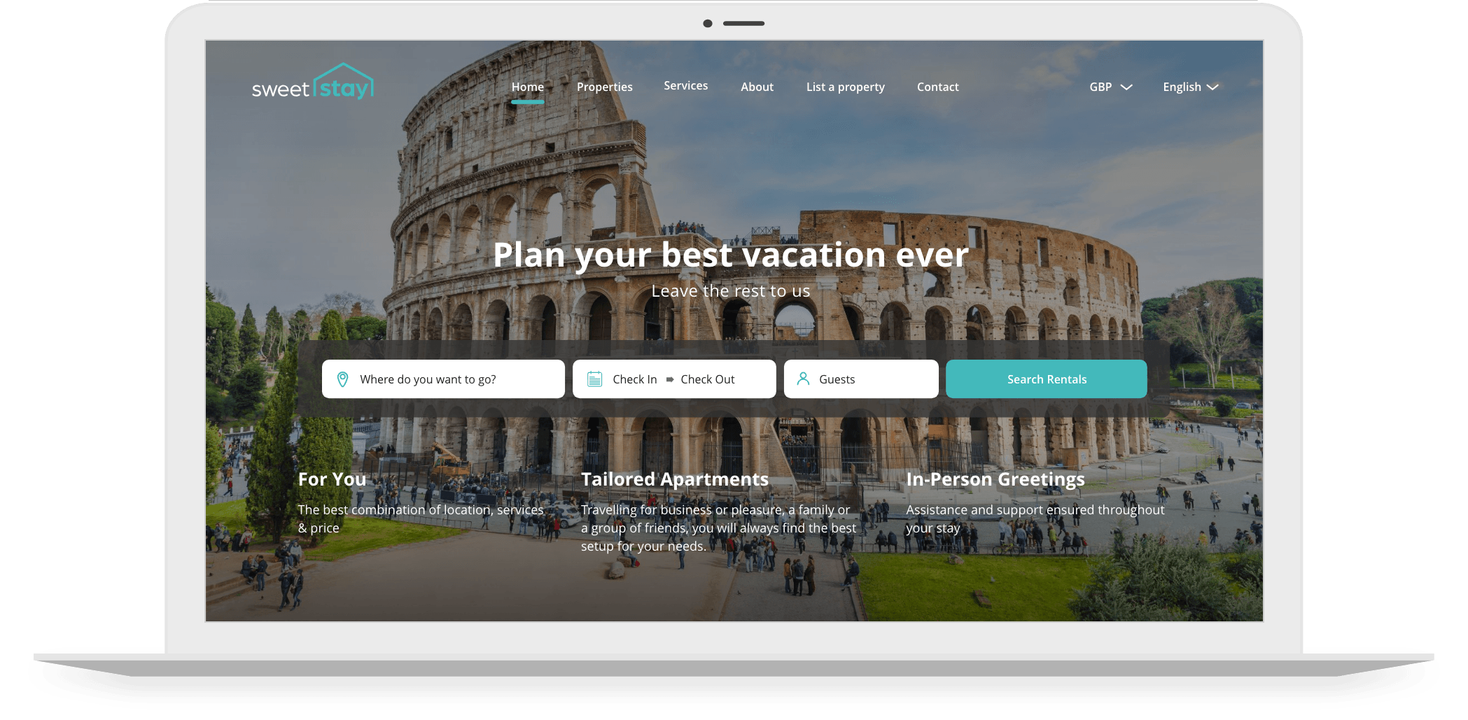
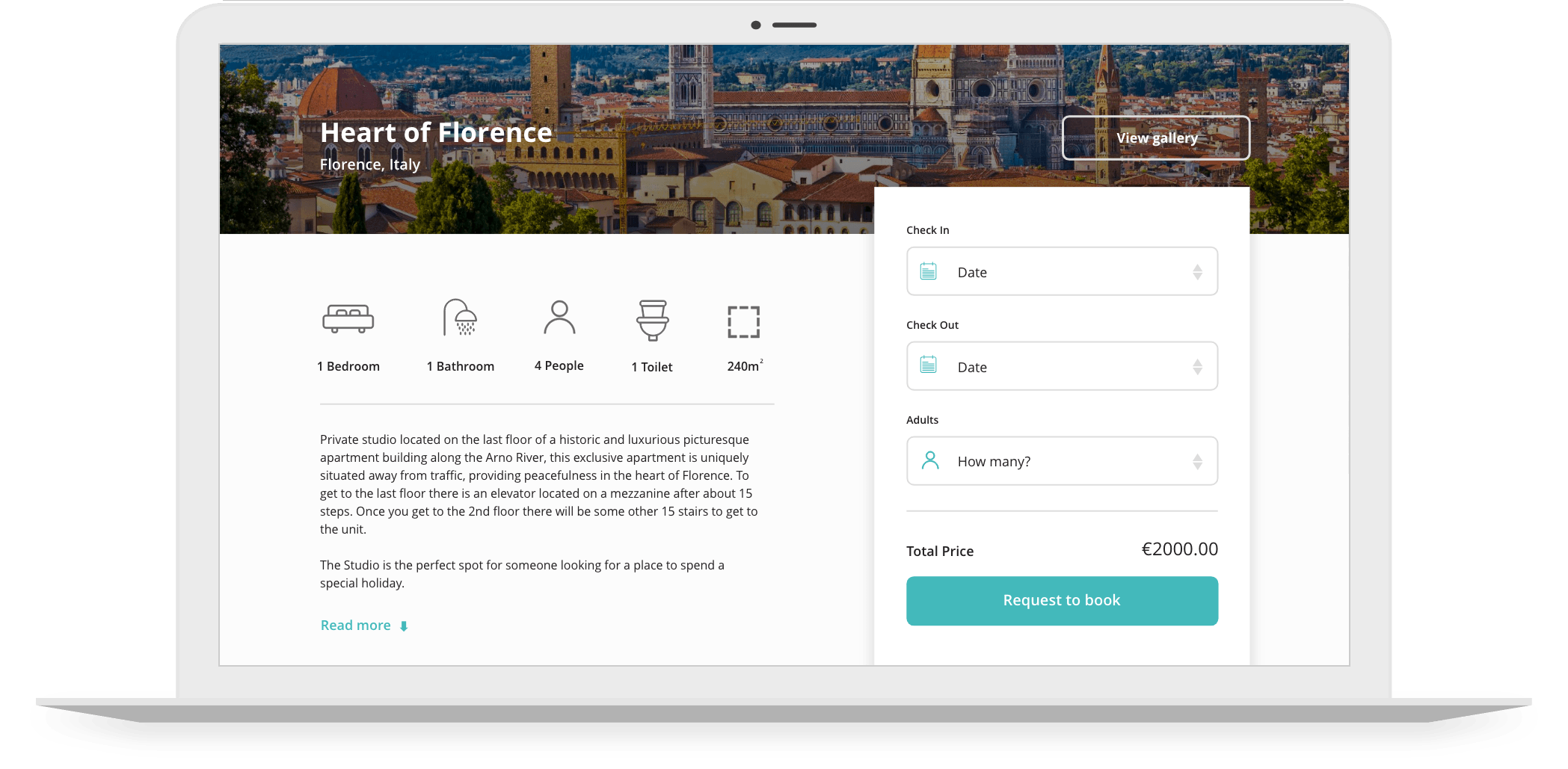
SWEETSTAY requested branding that would present them in a fresh and contemporary way. The brand needed to appeal to all its target markets; landlords, professionals and holidaymakers. Our designers had the freedom to get creative with logos and colour schemes from this brief. Once designed, the development team implemented stationery, marketing materials and a BookingSync website template.

ACTIONS

Our in-house designers collaborated with one another. Conducting research and creating mood boards before starting work on the design of SWEETSTAY’s logo and branding. The logo needed to portray SWEETSTAY’s service. Offering subtly and professionally, the outline of a house over ‘Stay’ was the perfect way to do this.


SWEETSTAY Actions


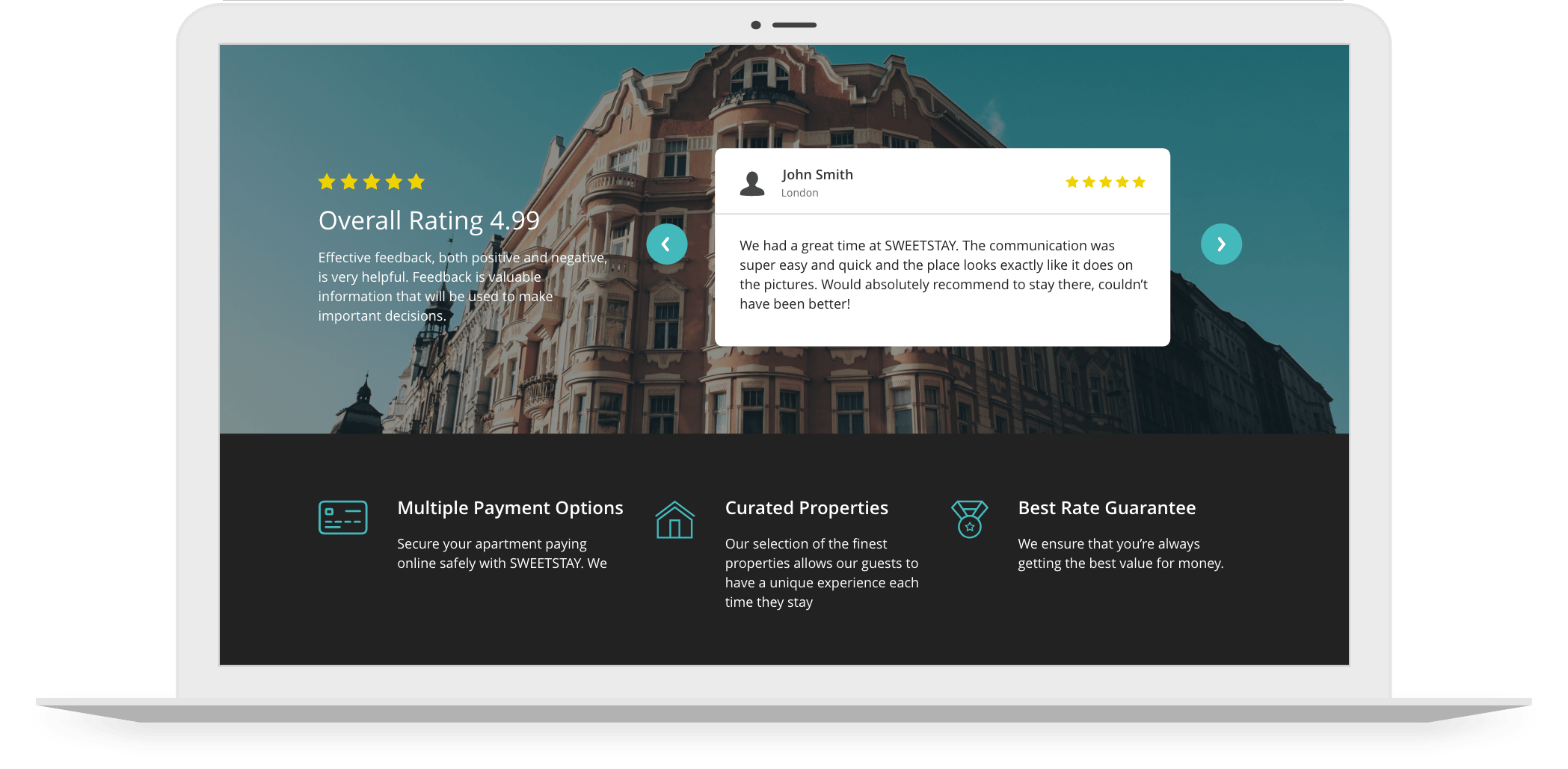
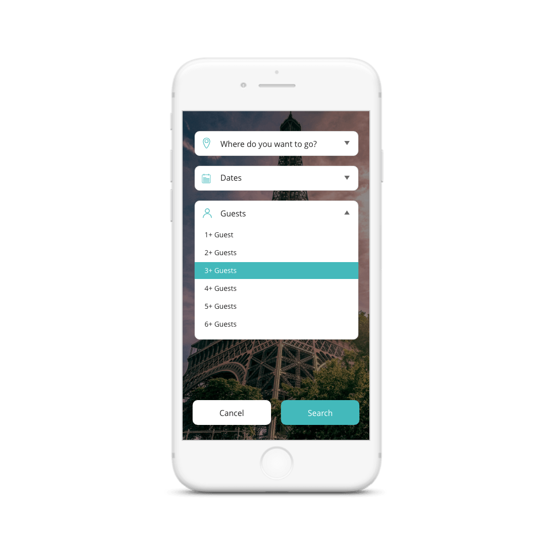
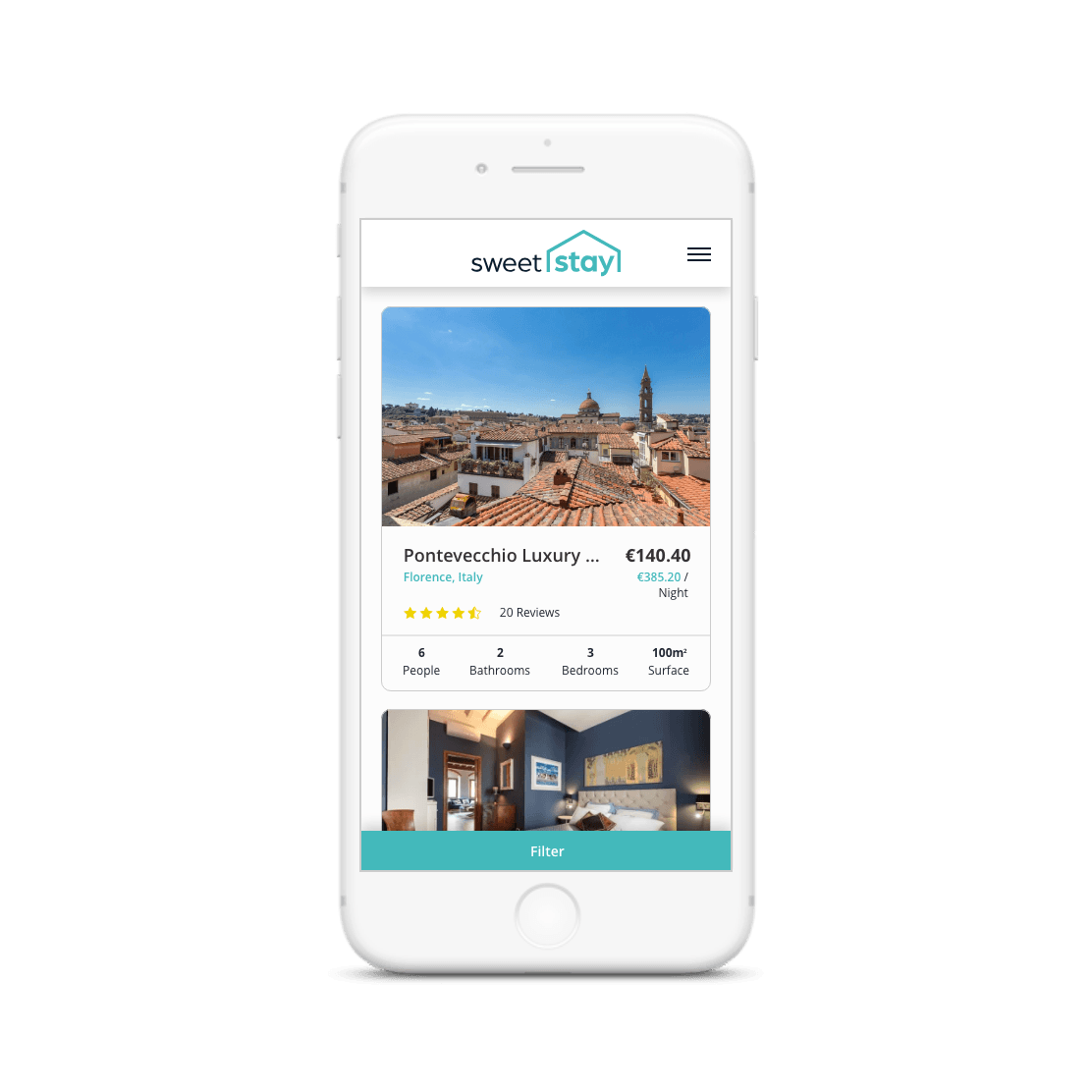
SWEETSTAY wanted to stand out amongst competitors, the use of turquoise throughout their logo and branding is visually enticing and fresh – just like the rental properties they offer! Once the logo and branding were approved, our designers implemented it onto the BookingSync website template and when creating bespoke stationary and marketing materials. The offering of additional services to customers is one of SWEETSTAY’s unique attributes, Foundry Digital created individual icons to represent each service in a bespoke way.

SWEETSTAY Mobile Image
SWEETSTAY Mobile image 2
RESULT

Overall, SWEETSTAY’S logo and branding will ensure that they appeal to all their target audiences and attain customer & client loyalty. Their logo and branding emanate a high standard of professionalism whilst simultaneously portraying their personable and approachable nature. The offering of additional services to customers is one of SWEETSTAY’s unique attributes, the individual icons created for each service help present their bespoke business. The design and creation of stationery and marketing materials and the implementation of branding on a web template extend SWEETSTAY’s branding both online and on paper.

VIEW WEBSITE


Send FDRY your brief

A logo and branding as visually enticing and fresh as the rental properties they offer.

woo-commerce big-commerce shopify Google Partner Meta Square TikTok