APPROACH
As an extension of FoodLogiQ, SmartFood Logistics required a website that communicated the FoodLogiQ product effectively, creating a strong case for why food professionals need to invest in their food traceability solution.

SmartFood Logistics is the European branch of the very successful and ever expanding FoodLogiQ. FoodLogiQ have built a strong reputation in the USA, providing food professionals with the means to trace food from farm to fork. By bringing this traceability solution over to the UK and Europe, SmartFood Logistics hope to provide European food professionals with the supply chain intelligence that companies require to meet customer demand for transparency.
As an extension of FoodLogiQ, SmartFood Logistics required a website that communicated the FoodLogiQ product effectively, creating a strong case for why food professionals need to invest in their food traceability solution.
Having taken the time to understand the SmartFood Logistics business, market and target audience, our design and development team got to work to create the new website.
It was key to incorporate the company branding, a fresh and clean colour palette, into the website as well as offering a clear and easy-to-use structure so that website users can navigate the platform with ease.


The website has a fresh feel, using background images of food produce and a white, green and grey colour scheme. There was a lot of content for pages to hold, so layout was crucial to avoiding a heavy and cluttered website.
The SmartFood website is structured so that users can navigate to info about a particular solution or specific industry. This enables a visitor to reach content that is relevant to them, which not only makes their experience more engaging but also informs them of how the food traceability platform can work for them, and why they should request a demo.
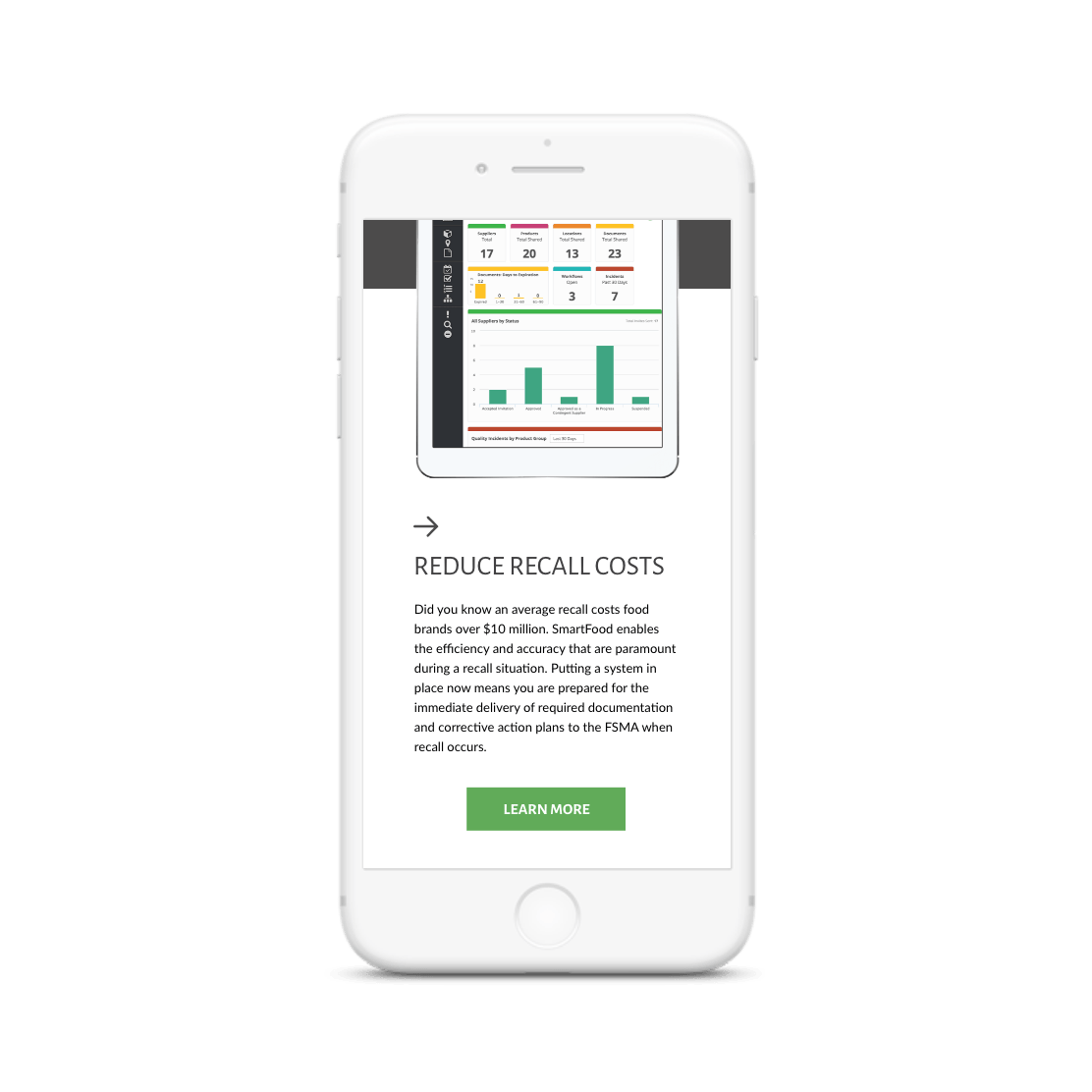
The pages of the website detail all features of the product, and are presented in a way that ensures the product is showcased as a worthwhile and beneficial investment. Accompanying the text are multiple screenshot mockups of the product’s dashboard and features to display the attractive and functional platform.
Fresh design and simple functionality