Lavolio

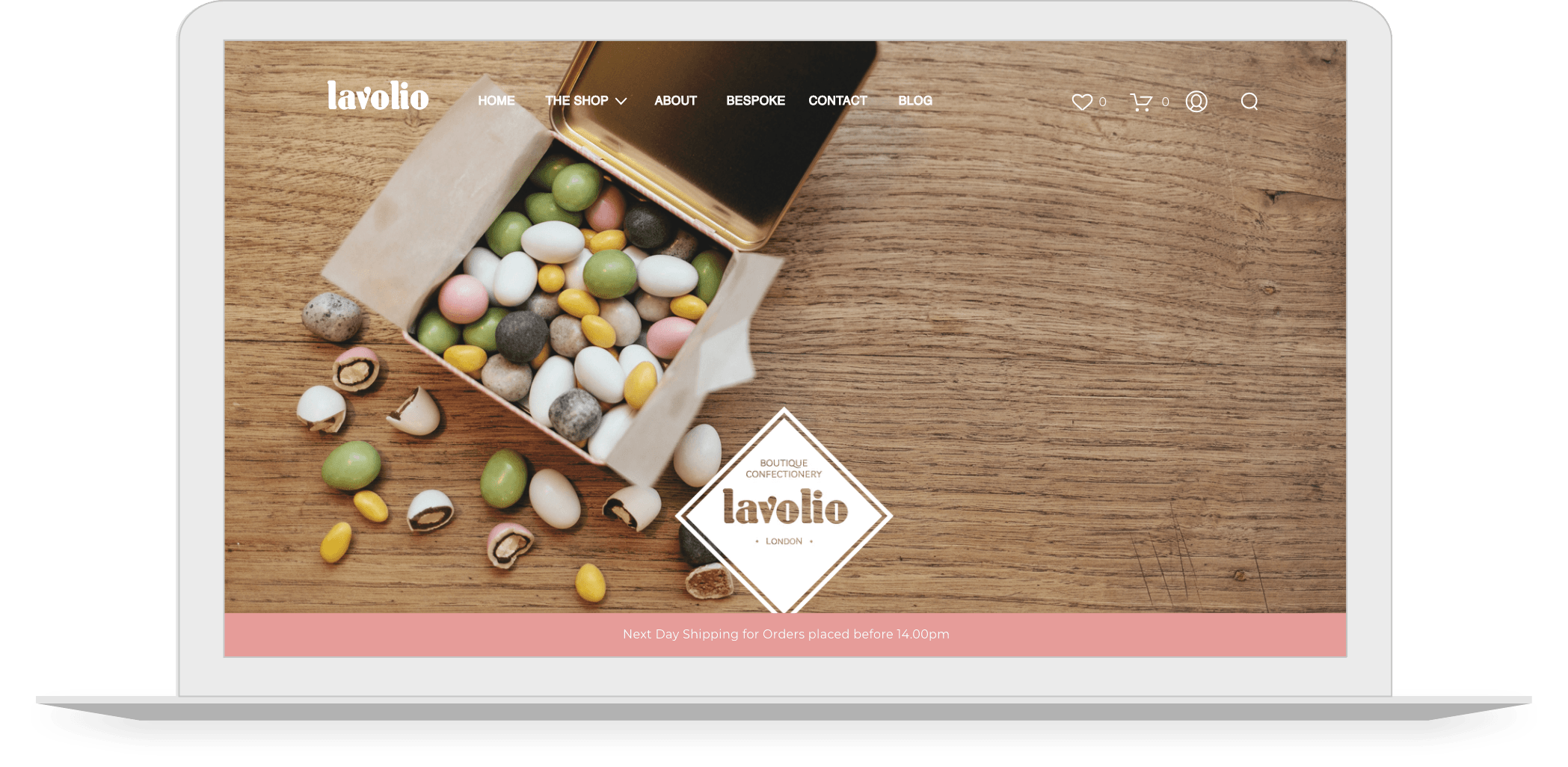
Ecommerce development to refresh Lavolio’s online presence to ensure it is inkeeping with their brand personality.

Lavolio image

THE BRAND

Lavolio create delicious one-of-a-kind handmade confectionery. They are much more than a box of chocolates, using real pieces of fruit, nuts and jellies wrapped in chocolate and spices. Each Lavolio sweet has a delicate sugar-spun shell hand made in the old-fashioned way. Making them the perfect indulgent treat or special gift!


brand-logo
APPROACH

Lavolio were looking for a website refresh. This was so that their online presence captured the development progress of the company’s vibrant personality and unique take on confectionery. The website refresh required thought into which colour schemes and layouts should be chosen. In order to achieve an outcome that would appeal to Lavoliio’s target audience to therefore boost their sales. At the heart of our website design and development was the understanding of the importance to create a great user experience that the Lavolio website could offer. Once this was put into practice it will boost Lavolio’s sales.


ACTIONS

A pink and white colour scheme was selected. Our designers were keen to offer a fresh and sophisticated look for the brand that aligned with their confectionery offering. It was important to make sure that this colour palette fit seamlessly with both the colours of the sweets and the decorative designs of the tin boxes. This is something that the new website designs sought to achieve. FDRY also worked to ensure that the user’s journey from the moment they enter the website to the moment they purchase Lavolio’s delectable delicacies was as smooth and effortless as possible. Once our designers had already achieved an enticing and appealing appearance for the Lavolio website,  we communicated a targeted CRO strategy to our developers. This is so that there is a consistency across both the visual and functional characteristics of the eCommerce website.


RESULT

Lavolio products have enticing photography.They are presented with a simplicity that is attractive, yet functional. This Showcases Lavolio’s confectionery in a way that aligns with the brand’s identity. The website is visual and displays products in a stylish way. Whilst also capturing the team’s passion for hand-made, bespoke confectionery. A carousel of images were incorporated into the Home Page. This is so that users would be welcomed to the website by being given a taster of what Lavolio has to offer. Further emphasising the visually enticing character of the website.

Our CRO strategy implementation resulted in an improved, smooth user journey that balanced engaging design with strong functionality. This provides website visitors with the best experience of the Lavolio brand.

Lavolio ecommerce image

Lavolio image phone 1
Lavolio image phone 2

Proving that eCommerce stores can extend and enhance a brand

woo-commerce big-commerce shopify Google Partner Meta Square TikTok