ACTIONS
Gather & Ghyll’s unique take on travel experiences meant that Foundry Digital could do what we do best; bringing unique and creative concepts to life. This required an original logo, selecting typography which best represented them, and choosing a colour palette that suited their style.
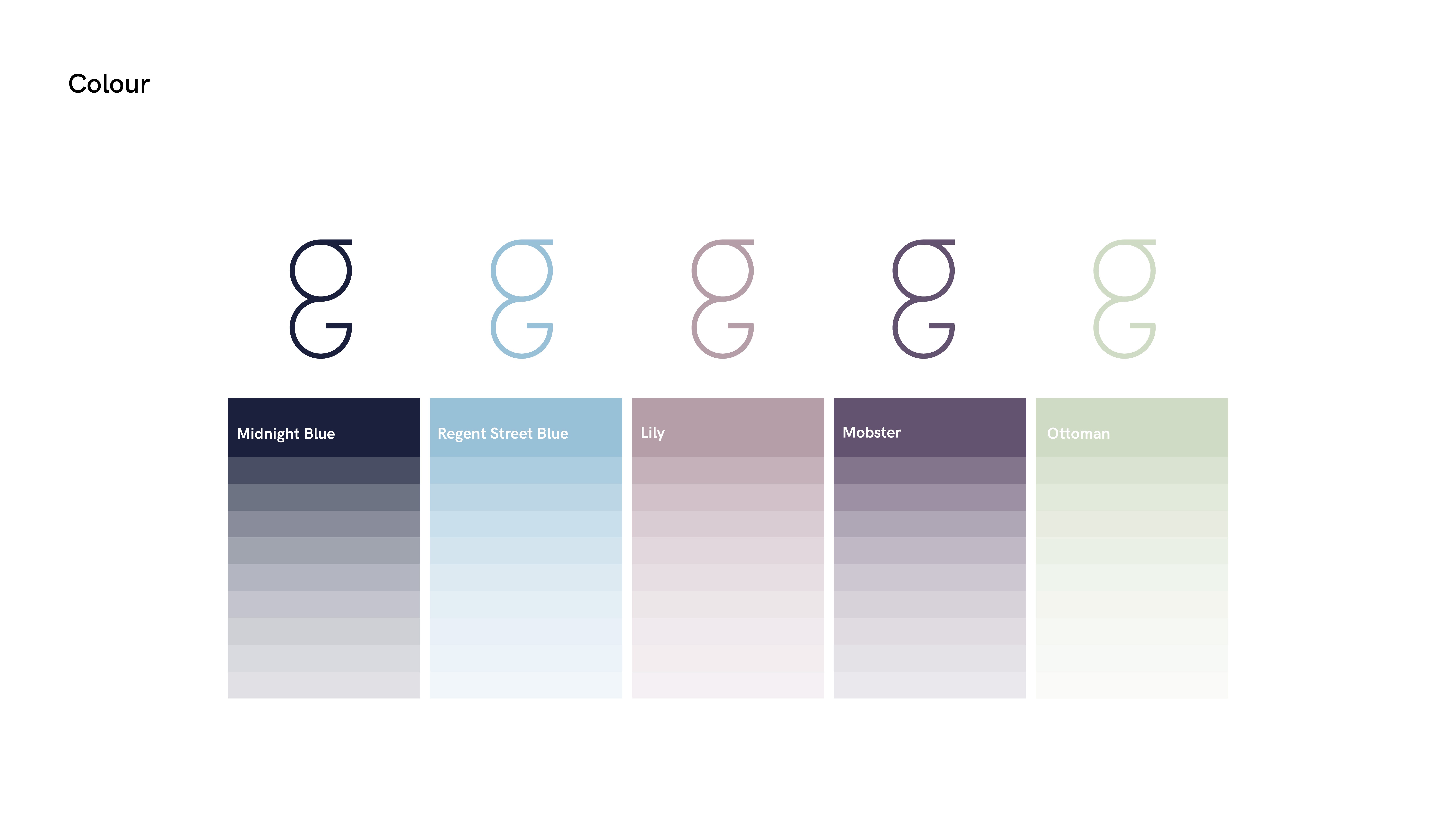
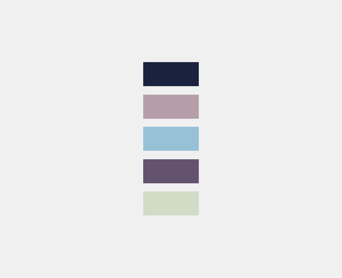
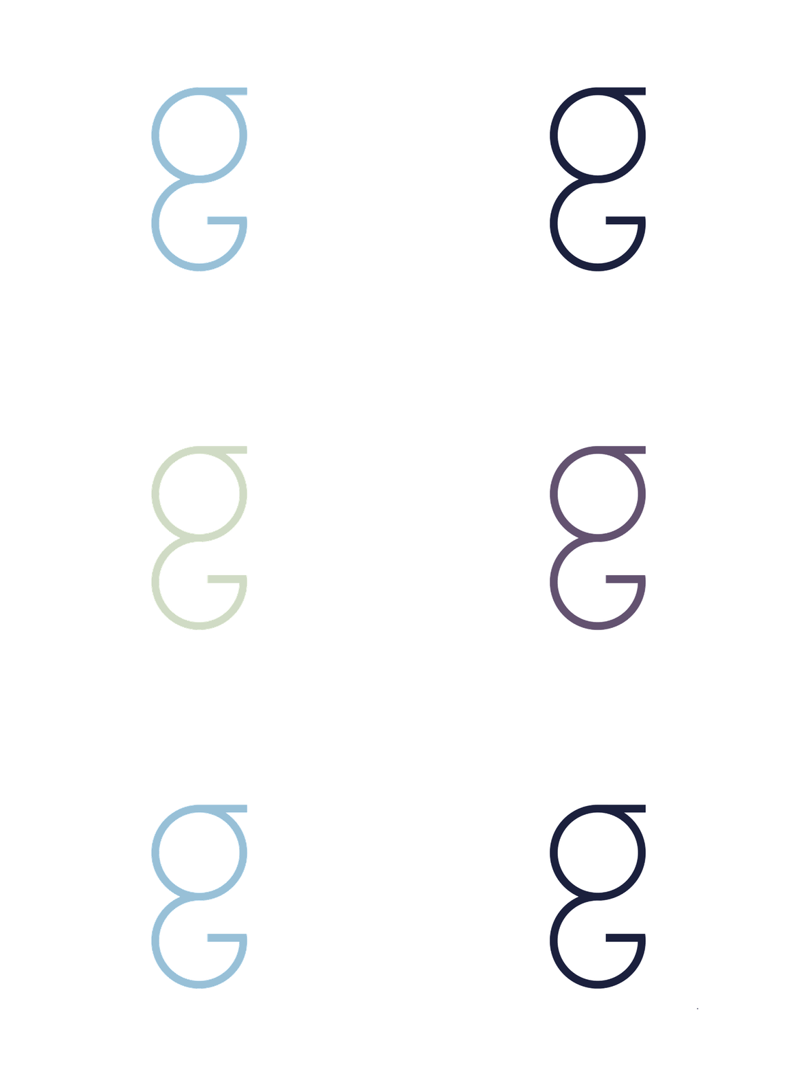
The colour palette wanted to incorporate the elegance that Gather & Ghyll bring to family travel and memories. Our designers went after a pastel colour scheme, a style which is often interpreted as soft and smooth.With the earthy tones selected, it manifests the aspect of nature, to bring the perfect colour palette for Gather & Ghyll.
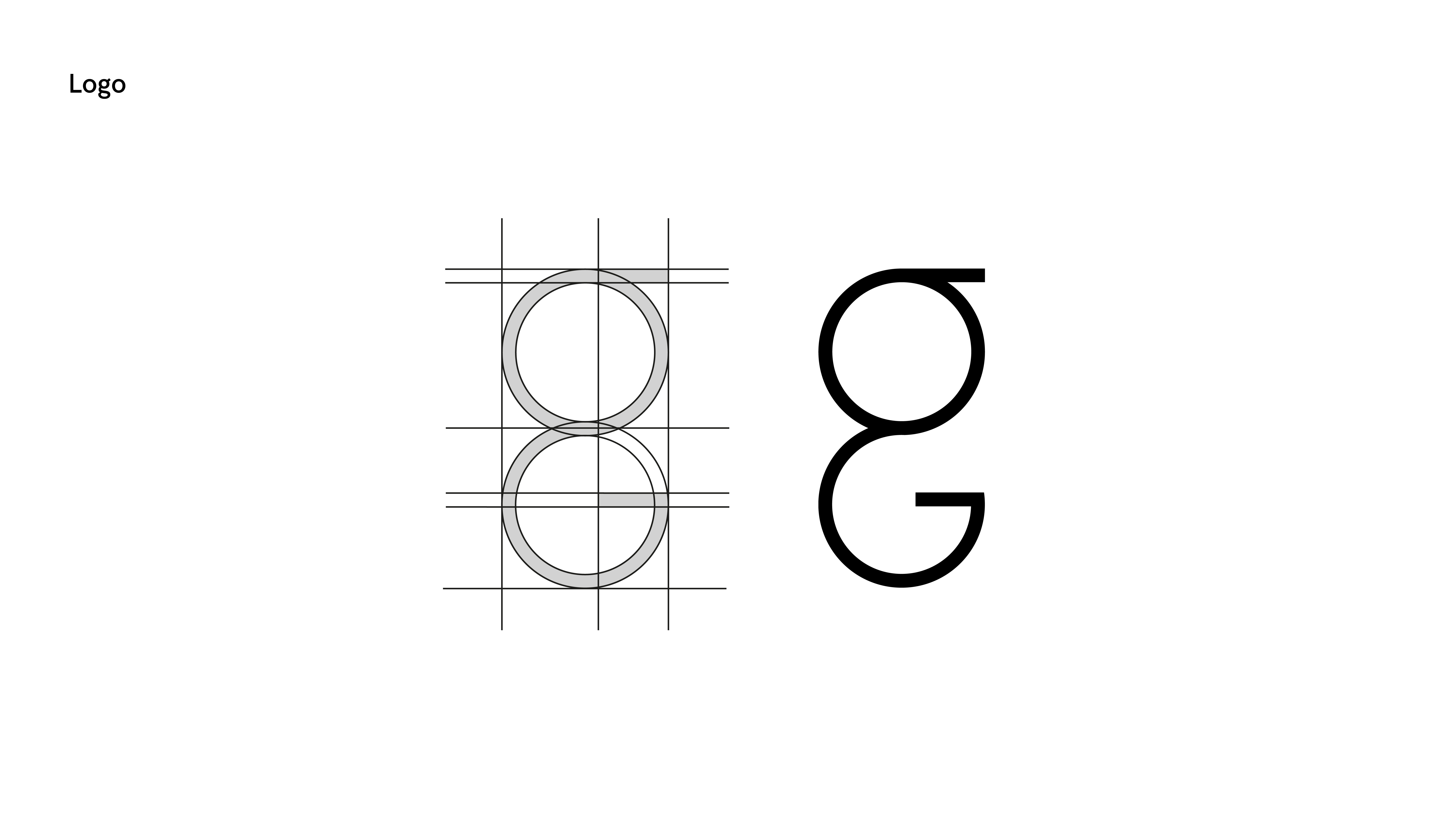
The logo was designed with consistency in mind. Our designers wanted to keep the aspect of the “G” incorporated in the design, as with the alliteration of the name. An upper case and a lower case “G” were merged together to create a minimal and simple design, with a hint of authority and stability.
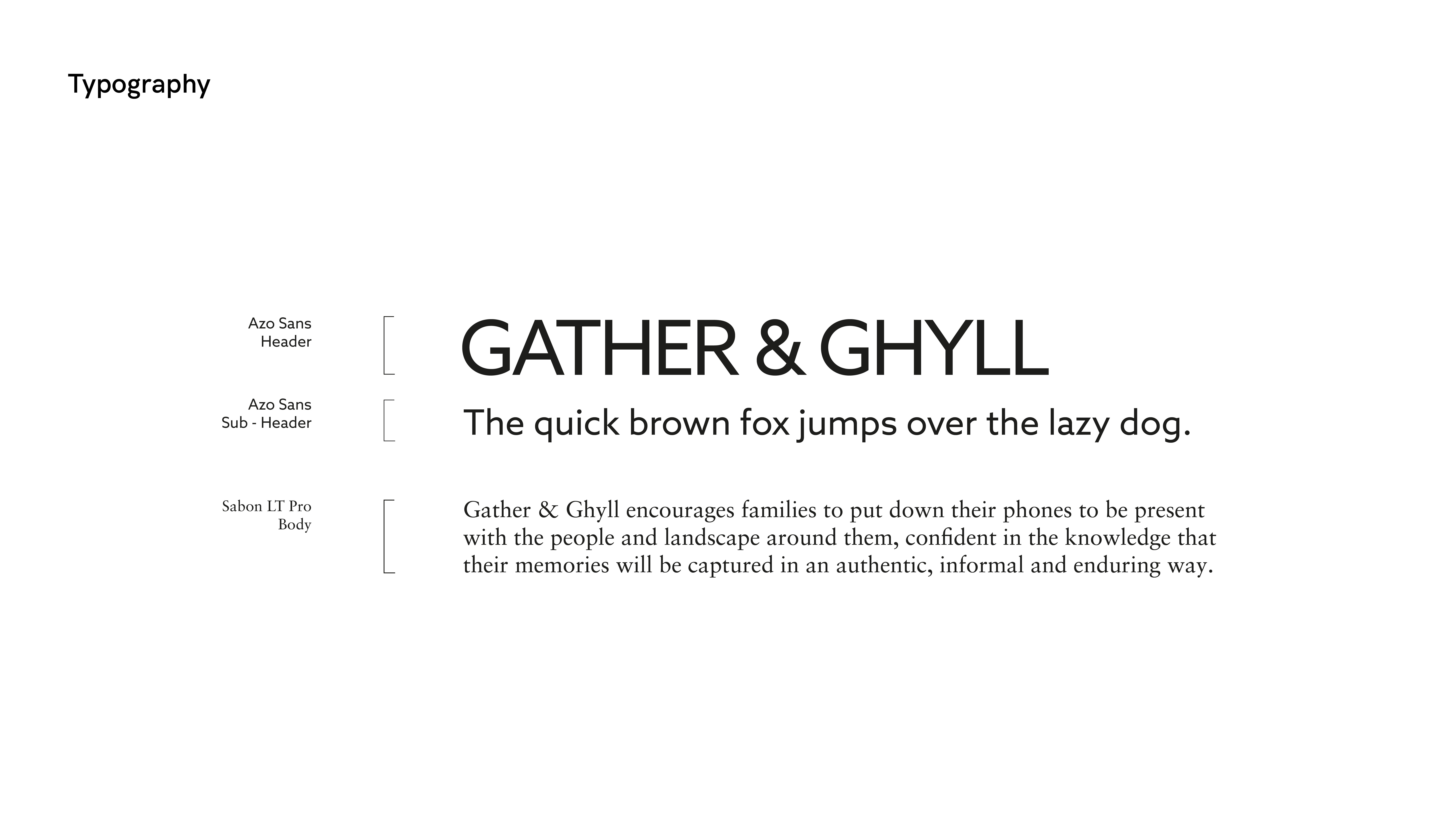
The typography was of utmost importance to make sure that the tone of Gather & Ghyll maintained its familiarity, elegance and approachability. A mix of Azo Sans and Sabon were selected, for headings and for the body respectively.
All of these elements worked together to fit with the the brief which wanted to embrace the familial, professional, and approachable style of Gather & Ghyll.


