Carlton Training

Website redesign for Carlton Training, a national workplace training provider.

THE BRAND

Carlton Training is a national workplace training provider. The company consists of a team of passionate and highly experienced professionals who deliver high-quality and nationally recognised courses covering an array of topics.

This year, the company split into two divisions – Carlton draining and CT Learning. This decision has allowed the company to strengthen the courses currently on offer, with Carlton Training driving the Teacher & Instructor and Assessor & Quality Assurance, whilst CT Learning focus entirely on the occupational safety and management courses.

brand-logo
APPROACH

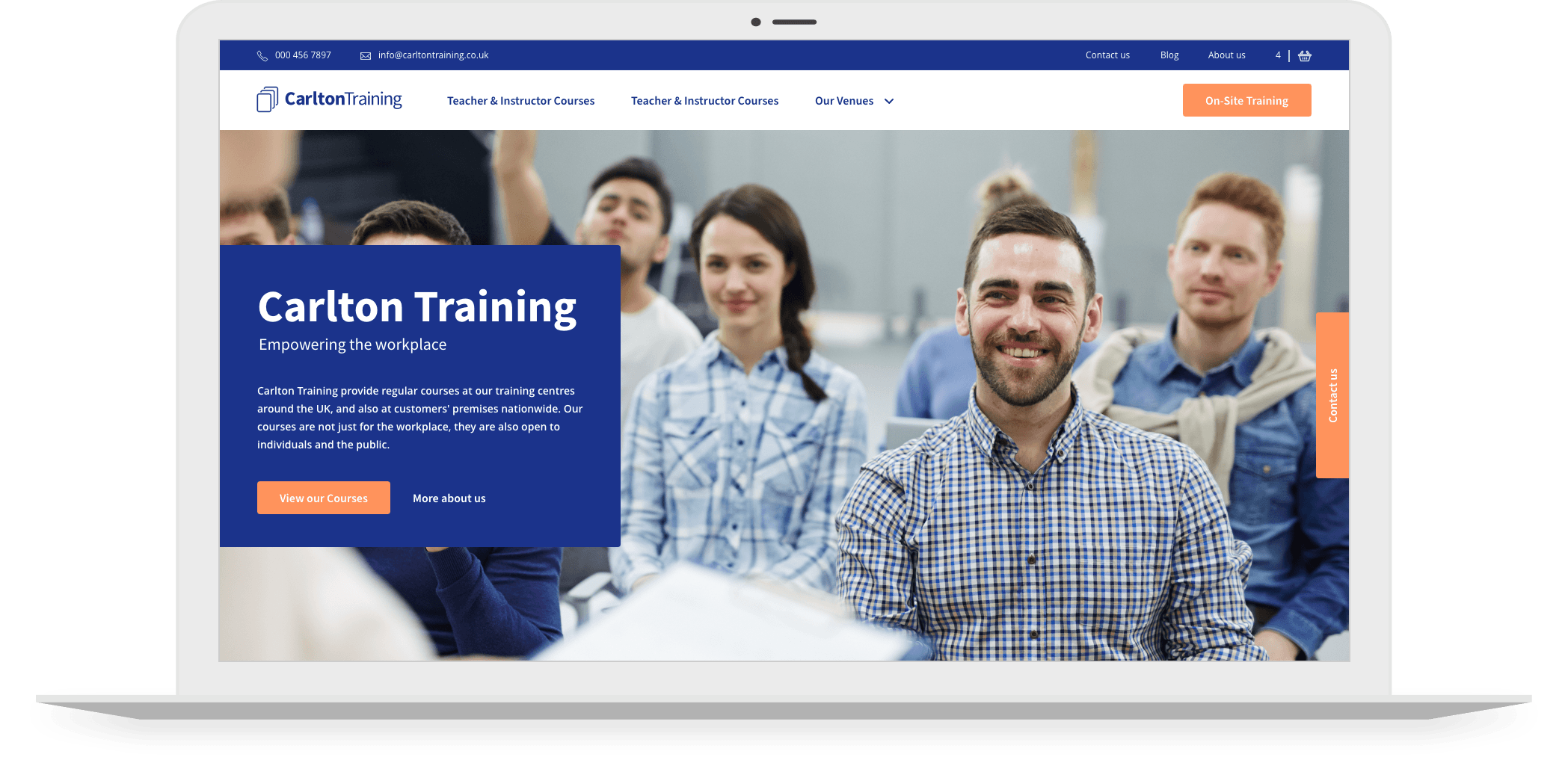
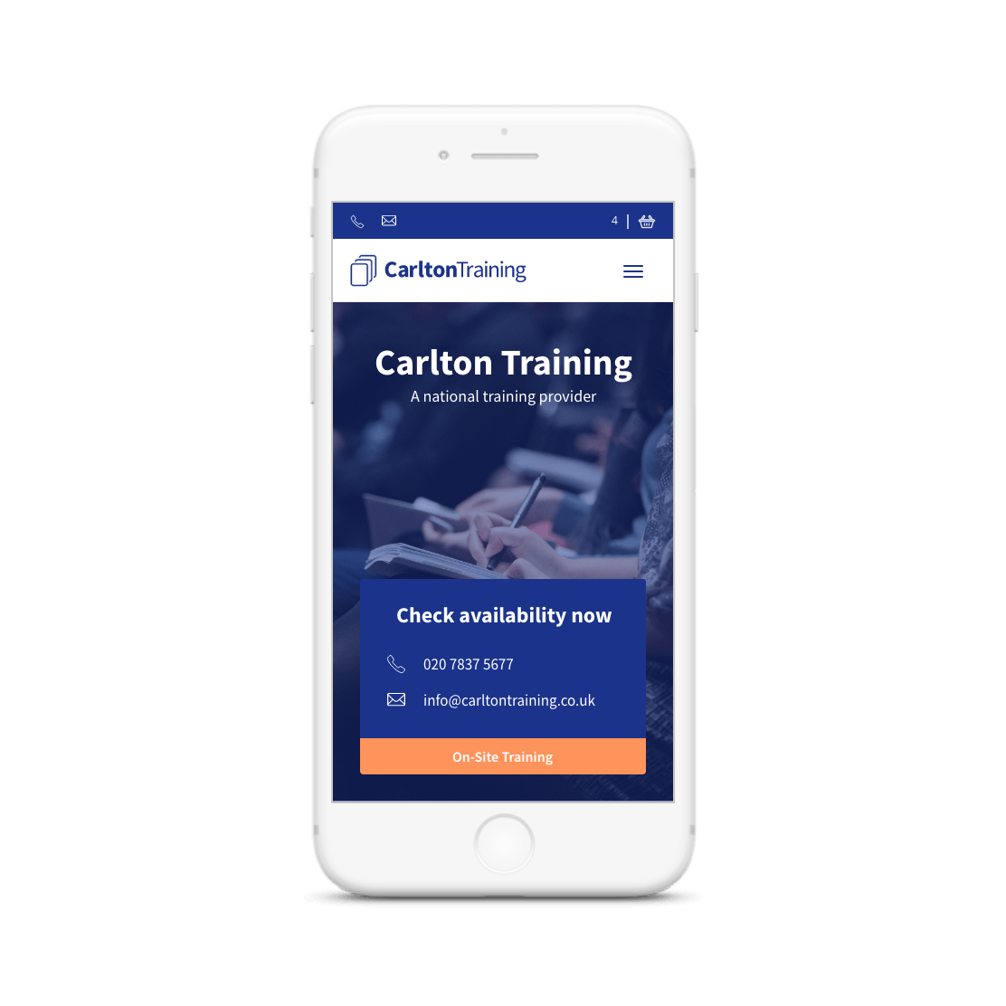
Carlton Training sought a refreshed website design suitable for both divisions of the company – Carlton Training and CT Learning. The plan was to work cohesively with their brand and create a positive user journey and smoother functionalities. The key focus of the website is to inform users about the courses on offer and encourage them to book.

Our approach was to create a clean and straightforward website that prioritised all course information. We worked towards creating a user-friendly, timeless website and created simplified processes for Carlton Training.

ACTIONS

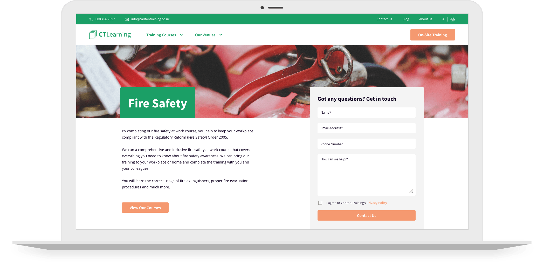
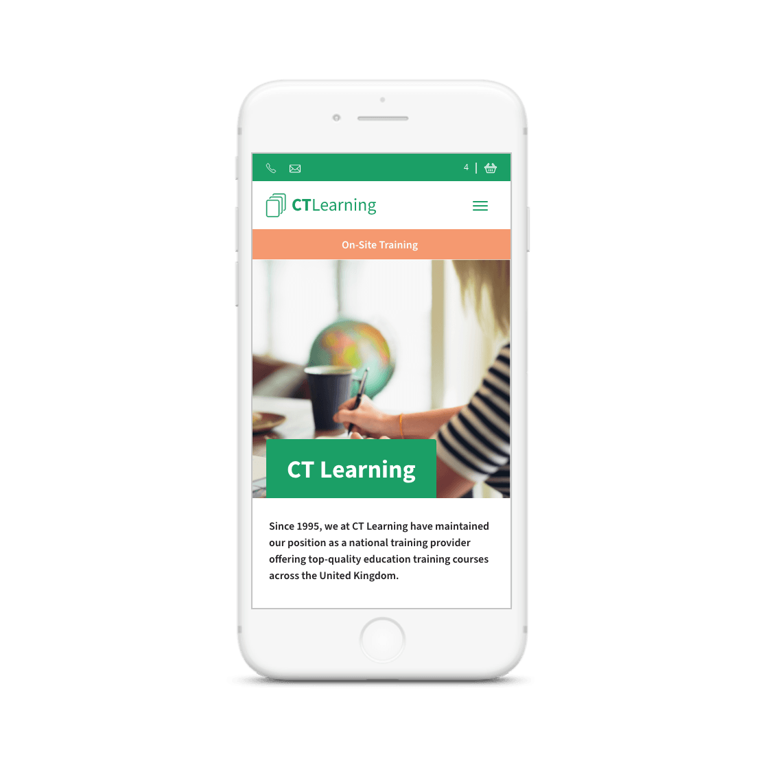
Our team of UI/UX designers incorporated the Carlton Training brand elements across both websites. Carlton Training’s design uses the blue and white reflected in the logo. We used complementary colours to create the CT Learning website to differentiate the two divisions. We kept the two websites linked by incorporating similar elements, including the colour orange.

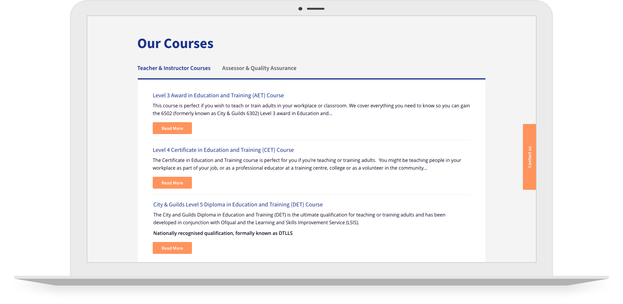
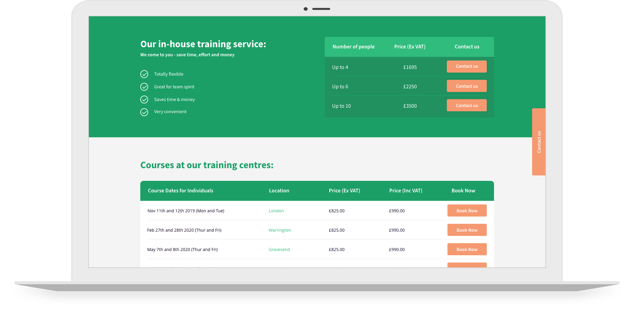
Each page layout construction focuses on the user in mind. Every page of the website was text-heavy, meaning we needed to create a structure that would result in the text being easy to read and navigate. We incorporated graphic elements within each page. We designed a visually appealing table to display all course information – date, time, location and booking button. This function worked as a block to split the copy.


RESULT

Bringing together large copies of content with a functional design resulted in the Carlton Training and CT Learning websites delivering an enjoyable user experience. The team at FDRY created a bespoke website that was informative and functional for every user.

VISIT WEBSITE

We worked with our client’s brand to develop two timeless websites that complement each other and provide a smooth user journey, ultimately encouraging users to register to their courses.

woo-commerce big-commerce shopify Google Partner Meta Square TikTok