Aestimo Technologies

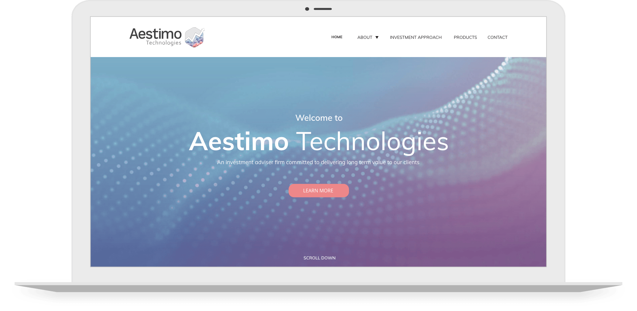
Website design & development that reflects Aestimo Technologies’ reliability and professionalism.

THE BRAND

Aestimo Technologies Limited is a UK-based quantitative investment advisor that harnesses quantitative techniques to extract profits from conditional inefficiencies in the European main equity markets through short-term directional positions.

brand-logo
APPROACH

Aestimo Technologies approached Foundry Digital looking to upgrade and refresh their current logo to make it more contemporary. The company are, quite rightly, proud of their history and the story behind their business, brand and their service and as such it was vital to have an area on the website where visitors can learn more about the investment advisors.

With regard to the brand identity of Aestimo Tech’s website, it was important to the client that the new logo design incorporated the original colour schemes and reflected all of the etymology.

ACTIONS

Our designers were conscious of fulfilling the brief given to them by Aestimo Technologies, so the colour schemes were incorporated into the logo refresh process. At the same time, the upward pointing arrow was put forward to reflect their drive towards targeting long term returns, thereby extending their business ethos into their brand identity.

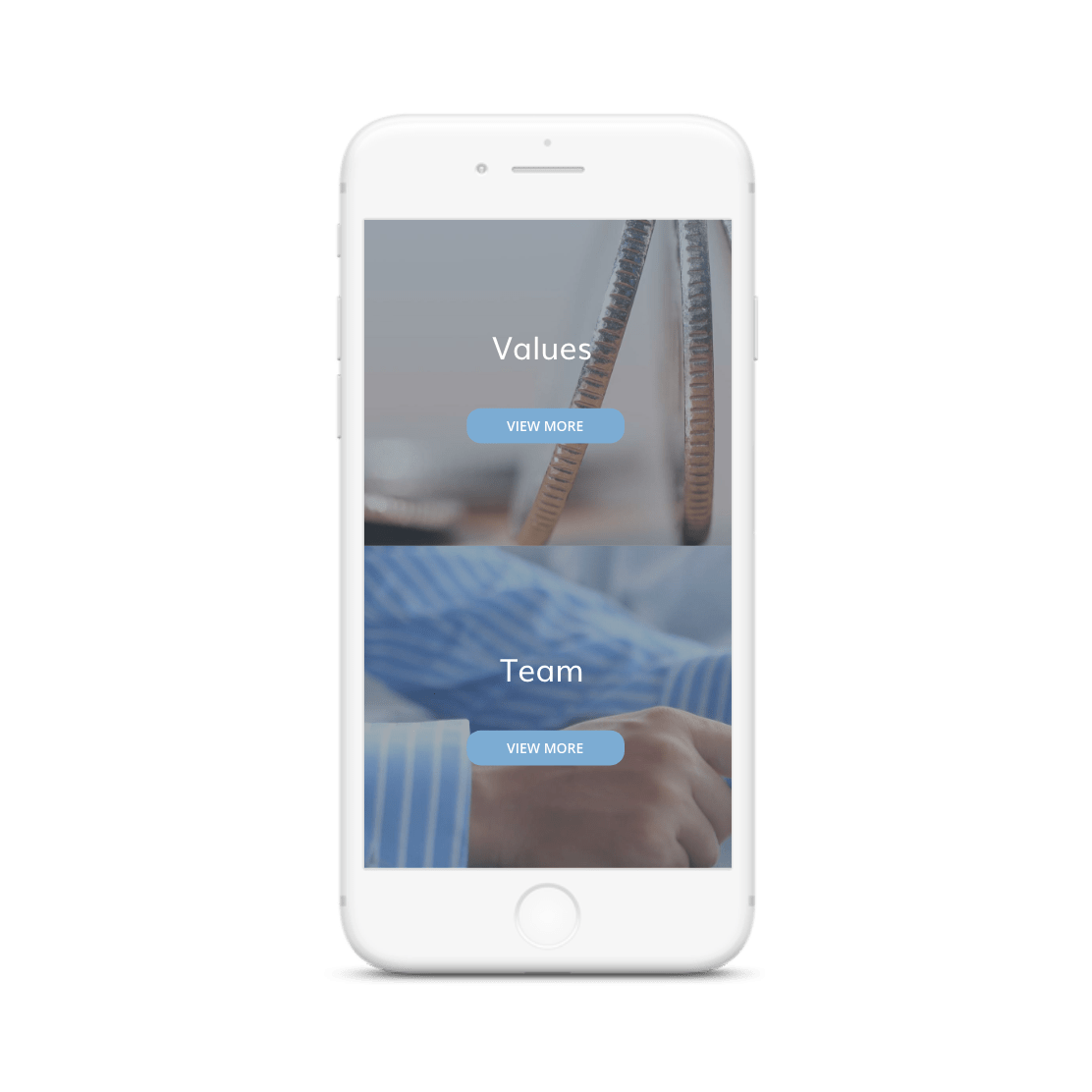
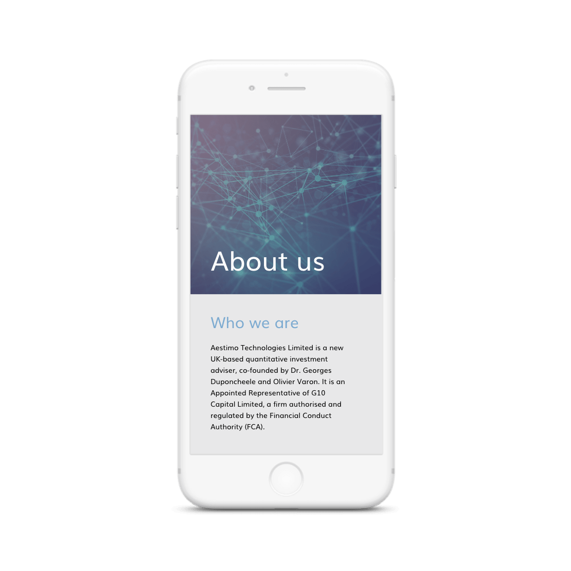
When deciding on the layout of the website, our website designers included an area all about the financial advisors. This is broken down into different sections, allowing a visitor to experience the full journey of how Aestimo Technologies came to be. It also simultaneously demonstrates the company’s reliability and professionalism, an important inclusion for Aestimo Technologies as investment advisors.

RESULT

The colour scheme chosen for the website incorporates all of the colours that appear in the Aestimo Technologies logo, allowing consistent branding to appear throughout the website. Different elements of the logo appear across the website, lending a sense of organisation to the structure of the website. As well as this, the website as a whole is visually informative so that the company can effectively speak to their audience.

The services that Aestimo Technologies offer are clearly laid out in the Products area of the website, again making their business increasingly accessible and easily understood by anyone who visits the website or wishes to learn more about the company.

Calls to action populate the pages, encouraging their audience to learn more about the business, read more about the information that they’re seeking, and to sign up to receive more news from Aestimo Technologies.

The website is very user friendly and allows visitors to access information about the company and their services with ease, and in a visually appealing way.

VISIT WEBSITE

Webdesign that achieves a visually informative layout

woo-commerce big-commerce shopify Google Partner Meta Square TikTok