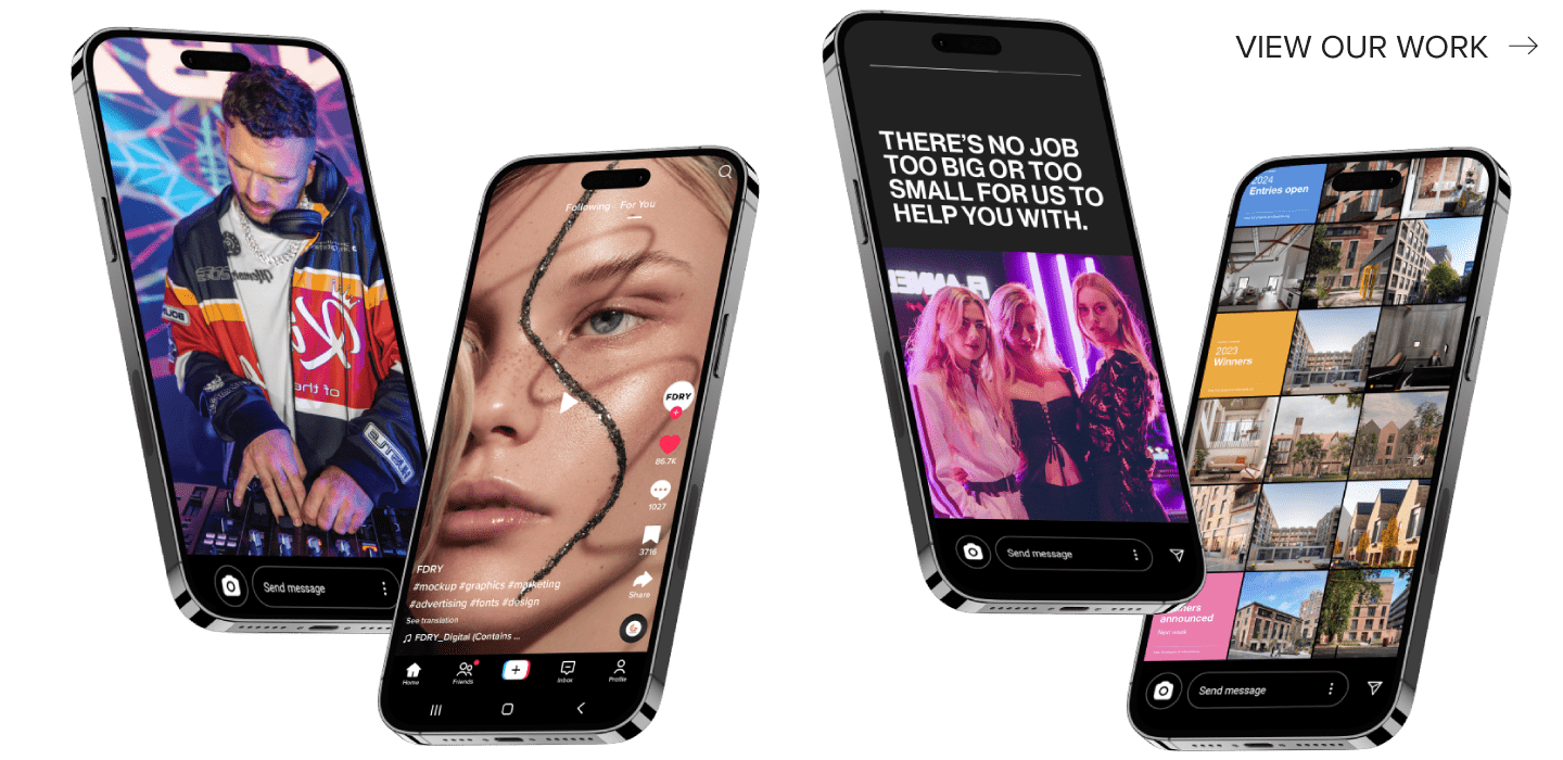
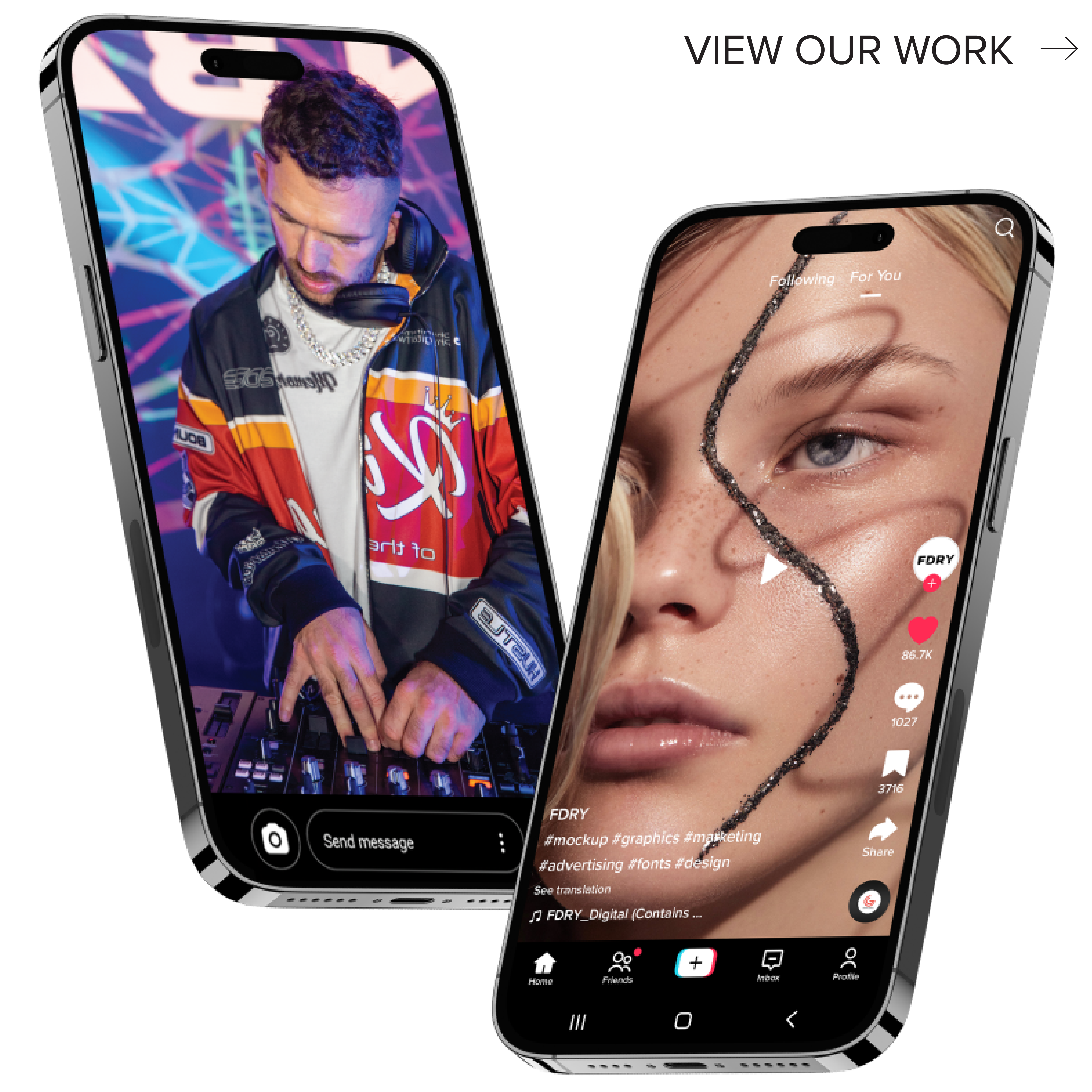
The use of technology in the beauty industry has surged over the years and it comes at no surprise that the majority of start-ups in 2019 have been focused on beauty tech. With the constant development of apps and websites, beauty lovers have been able to see the possibilities for beauty businesses within the tech sphere. With a wealth of beauty apps on the ready for consumers to search, we can’t help but explore what makes good beauty app design. Here are the top 3 elements for successful beauty app design
#1 Keep it transparent
Layout
A key element in beauty app design is the need for transparency for users. Clear navigation is the first thing that will make an enjoyable user journey and encourage further movement throughout the app. This can be done in a multitude of ways, from list type menus, full-screen navigation, grid-style menus and many more, however, each comes with pros and cons so it is important you understand your desired user journey. The pages contained within the app or website will have to follow suit to maintain consistency.
Content presentation
The nature of the beauty industry means there is a lot to offer in terms of services, thus making sure that each of these is presented in a concise and informative way will give users the best experience possible. As an individualised service, vague information and descriptions won’t do. If it doesn’t work for the user, it won’t work for you! There is more to think about than simply inserting the content onto a website, the design and layout can aid the readability and interest ensuring the user gets the most out of the information.
#2 Understanding both market and user variables
Beauty apps typically hold an interface for customers as well as beauty professionals, meaning there ought to be a greater understanding of the market in regards to both. Beauty apps are user-generated platforms and rely on the users and professionals communicating effectively. Thus communication and rating systems are of utmost importance in terms of functionality. In the age of communication, it can often take more than a simple message for effective communication from both parties, in which case rating systems can be put in place. According to the desired look and feel of the app, these rating systems can differ and be implemented creatively using design techniques.
#3 They’re not cheap
Investing in a well designed and developed beauty app is necessary to get the best return. Depending on the specifications of your brief and goals, the number of functionalities and cost will differ accordingly. For example, a booking interactive system versus artificial intelligence has different functionalities that will alter the amount of effort and time spent building each one. No matter the level of technology involved, the design contains the ideal user journey, desired functionalities and overall holds the app coherently, thus playing an important role as the first point of reference for its development.
Need help building your beauty app?
Backed by years of experience in web and app design, FDRY understands the necessity of functional, beautiful and user-friendly design to gain success. Take a look at what we can do for you and send us your brief, or just give us a call or email for a free initial discovery session before we make your ideal beauty app a reality


